
The impact of daylight on our colour choices
I asked recently on my Instagram Stories what everyone’s main decorating or interior design challenges were at the moment, and the answer that popped up most was the feeling of overwhelm when it comes to choosing paint colours. There’s just too much choice. I hear ya, been there, done that, got ALL the samples.
So I will soon share my top tips based what I’ve learnt so far about colour in interior design, but the one biggest factor that affects colour in our homes is the light. Natural daylight, where it comes from (the sun, obviously, but I mean the specific direction it comes from), and how it can impact our choice of colour. It’s so important that I think it’s worth a post all of it’s own, to help us understand what we need to know and exactly how we can use our new-found knowledge to aid our decision making in the paint aisles of B&Q.
Daylight has more to do with how we use our homes than you might even realise. It often dictates how we use a room, when we use a room, where we position furniture, our lighting requirements and, of course, colour.
The simple thing you need to know about any room in your home is which direction it’s facing – when you look out of the main window in that room, are you facing North, South, East or West?
Easy peasy to do these days as most smart phones have a compass. Once you know which direction your daylight is coming from, you can start to understand a bit more about how that light changes through the day and how it can completely change your perception of a colour on your walls. First, let’s understand a little more about paint…
Paints include pigments which gives it the colour and coverage. Pure brilliant white is the only paint colour that has no pigments AT ALL which means it reflects all light and bounces it round the room. Don’t be fooled into thinking that this means you can brighten up any room by painting it pure white… it reflects ALL light, whether that’s bright and warm light, or cool and dull light. If it’s the latter, you will find the room becomes even more dingy-looking as you’re just bouncing dull light around the space.
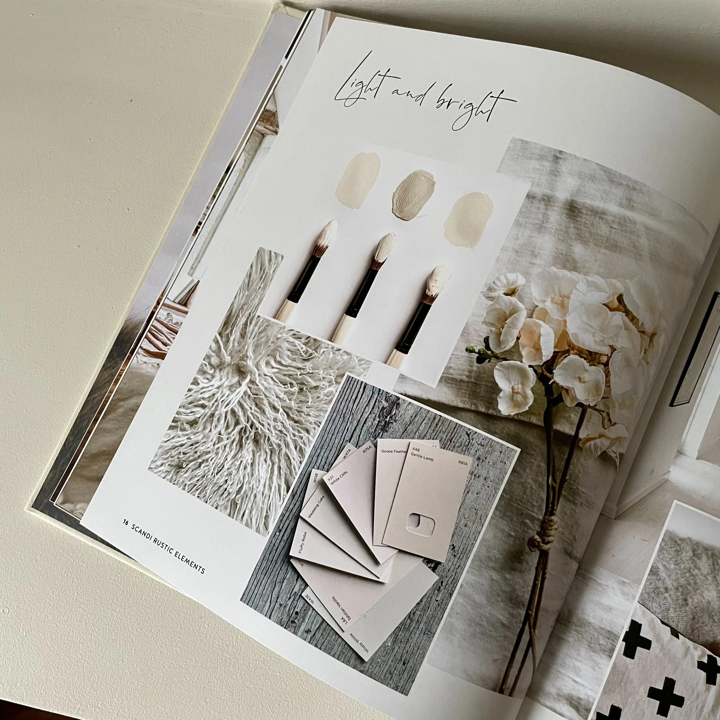
All other paint colours include pigments which form the base of the colour, and it’s the subtle changes in those pigments – or ‘undertones’ – that make all the difference in how your paint can look. It can be hard to tell what the undertones are when you look at a paint colour alone but put your samples or swatches alongside each other and you’ll soon be able to see which ones feel cool or warm in comparison to each other, even if you can’t pick out the specific undertone colours.
So, how does this have anything to do with which way your room faces? Well…
North-facing
In the Northern hemisphere, North-facing rooms tend to get the s**t end of the stick when it comes to sunlight. Typically a Northern room will get less direct sunlight and the light it does get is cool, meaning it has a green or blue hint to it.
So with paint colours, you’re likely to want to balance out that coolness with something warmer. Think pinks and yellows, and if you’re after a more neutral colour such as a shade of white or grey, you’re looking for the neutrals that have those warm undertones. Avoid neutrals where you can see any hints of green or blue as they will lean into the cool light instead of balancing it out with warmth. That doesn’t mean you can’t go green in a North-facing room, just pick a colour that has a warmth to it, think earthy greens or rich jewel tones.
Also, consider going against your instinct to brighten up a North-facing room by embracing the natural darkness by going for a really dark colour, if it suits the purpose of the room. It creates a cocoon-like effect and with the right furniture and lighting can actually feel warmer and more snug.
Try an earthy terracotta like Flower Pot by Earthborn for a balancing injection of colour, Greige 02 by Lick is a nice taupe for a warmer neutral, embrace the green tones with the likes of an earthy Bancha by Farrow & Ball, or if you’re chasing that airy feel try Jasmine White by Dulux.


South-facing
We’ve all heard of people who are looking for the dream house with the ‘South facing garden’… well this is because South-facing rooms (or gardens) enjoy a strong, warm sunlight all day long. Assuming you want to balance that warmth and avoid the room looking ‘hot’ with a permanent yellow or pinkish hue to it, the advice is to go for a pale shade that will enhance the light and airy feel.
Look for shades of green, blue and even purple (more violet with blue undertones, than lilac with pink undertones) to create a light, calming South-facing space. Same goes for neutrals – yellow or pink undertones will make an off-white look really cream while the green/grey tones will appear airy and fresh.
Alternatively, as with a North-facing room there is always the option lean into what nature is giving you, and in the case of South-facing room that would be to create a glow and a warmth with a pink or yellow shade. Avoid a 90s style yellowy cream wall though - leave the yellow-based neutrals alone and go for something more bold with a stronger injection of colour.
Sweatpants by COAT Paints and Greenwich Time by Mylands are good options for that soft, airy neutral feel, or try Willow Tree by Dulux for a slightly stronger colour or lean in to the warmth and give your room a positive glow with a dusky pink like Setting Plaster by Farrow & Ball.


East and West-facing
These rooms are a little more complex as they each receive more direct light at different times of the day so the perception of a paint colour will change with it. East-facing rooms will benefit from the morning light but will feel cooler as the day goes on, while the opposite is true for West-facing rooms. In short, there is no right or wrong here, you just need to consider here how and when you use the room most and how you want to feel when you’re in it.
Maybe you have an East-facing room where you want to enhance the bright morning light and want it to feel airy and fresh… go for a slightly cooler shade such as a soft green or blue (or a neutral with a green undertone), which will offset the warmth of the morning sun but will feel a little colder in the evening. This is where good artificial lighting is crucial, to create a feeling of warmth and atmosphere even when the natural light isn’t doing it’s best work. A West-facing bedroom would be nice in a warmer shade, no-one likes to wake up to a cold-looking room in the morning and once that evening sun hits it will feel extra cosy.
Any of these colours could work depending on what you want from the room and when you use it, as they all have the ability to either embrace and glow with the direct sunlight, or balance it to create a more calming effect, and vice versa when the light is cooler at the other end of the day. Peignoir by Farrow & Ball, Portland Stone by Little Greene, The Drink by COAT, Healing Spice by Dulux.


So understanding the natural light of your room is key, now asking yourself how you want to use and feel in the room is the next step to deciding if balancing out or enhancing the natural light of the room will achieve the look you want. It’s essential that you test a paint on all walls of a room because the light will not only differ between rooms but it will look different on different walls in the same rooms.
If you have a paint or colour challenge in your home, please take a look at my Support & Advice package and get in touch for a chat. I’d love to help!